Cooper Cafe - Redesign
Industry: Food & Beverages - Nutrition & Diet
Services: Logo Design & Branding // Print & Marketing Design // Menu Design

-
Heirloom
-
Purposeful
-
Welcoming
-
Casual
-
Effortless
- Heirloom - Purposeful - Welcoming - Casual - Effortless
Brief
In this conceptual brand narrative, Cooper Cafe has been a cornerstone of the community for over 30 years, serving up shareable meals that blend flavors and cultures. As the next generation of Cooper’s family steps in to continue the legacy, they’ve embraced a rebrand that bridges the cafe’s cherished roots with a fresh, inviting identity. The goal? To assure long-time regulars that the heart of Cooper Cafe remains unchanged while inviting a new generation to experience its warmth and flavor.

The Solution
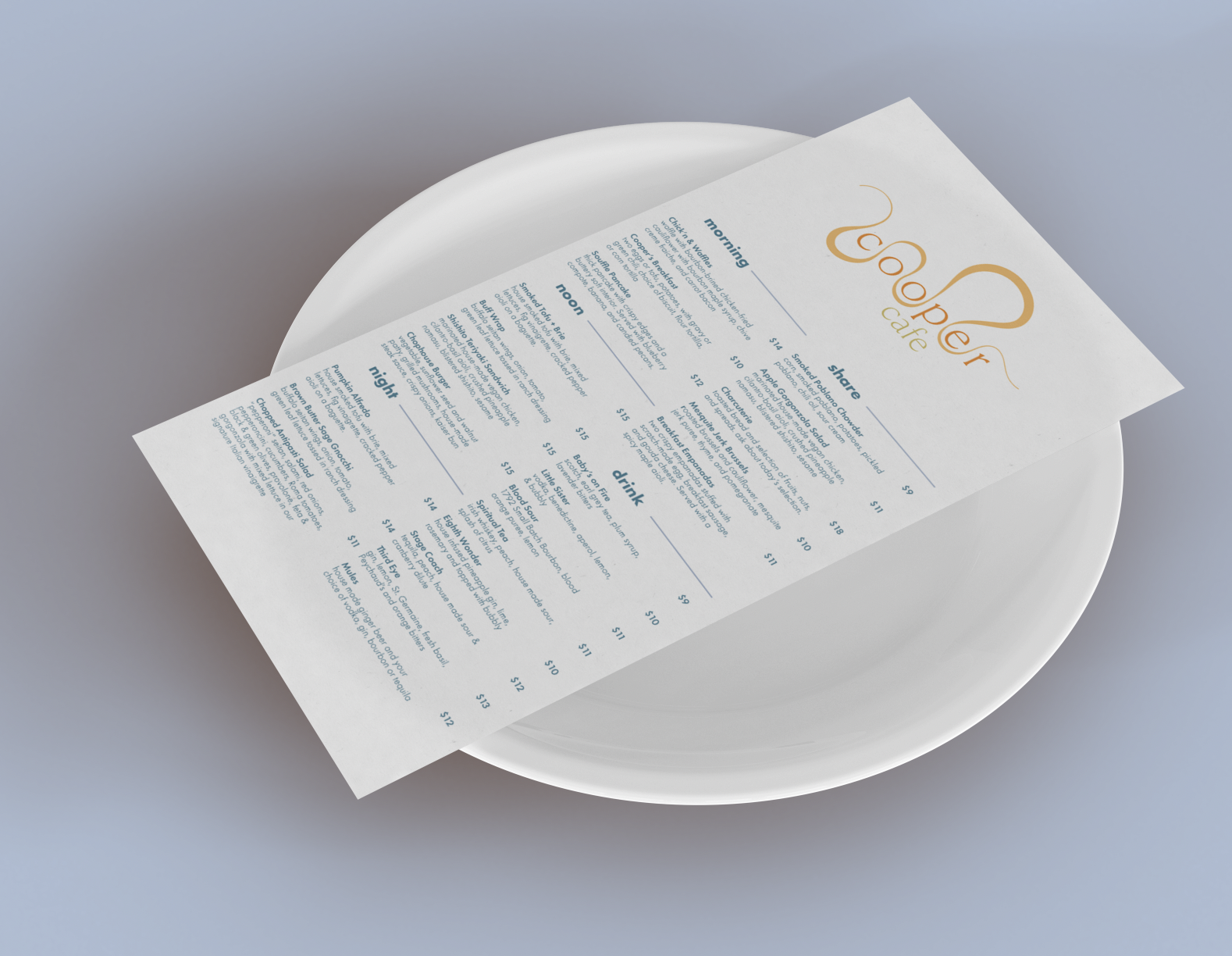
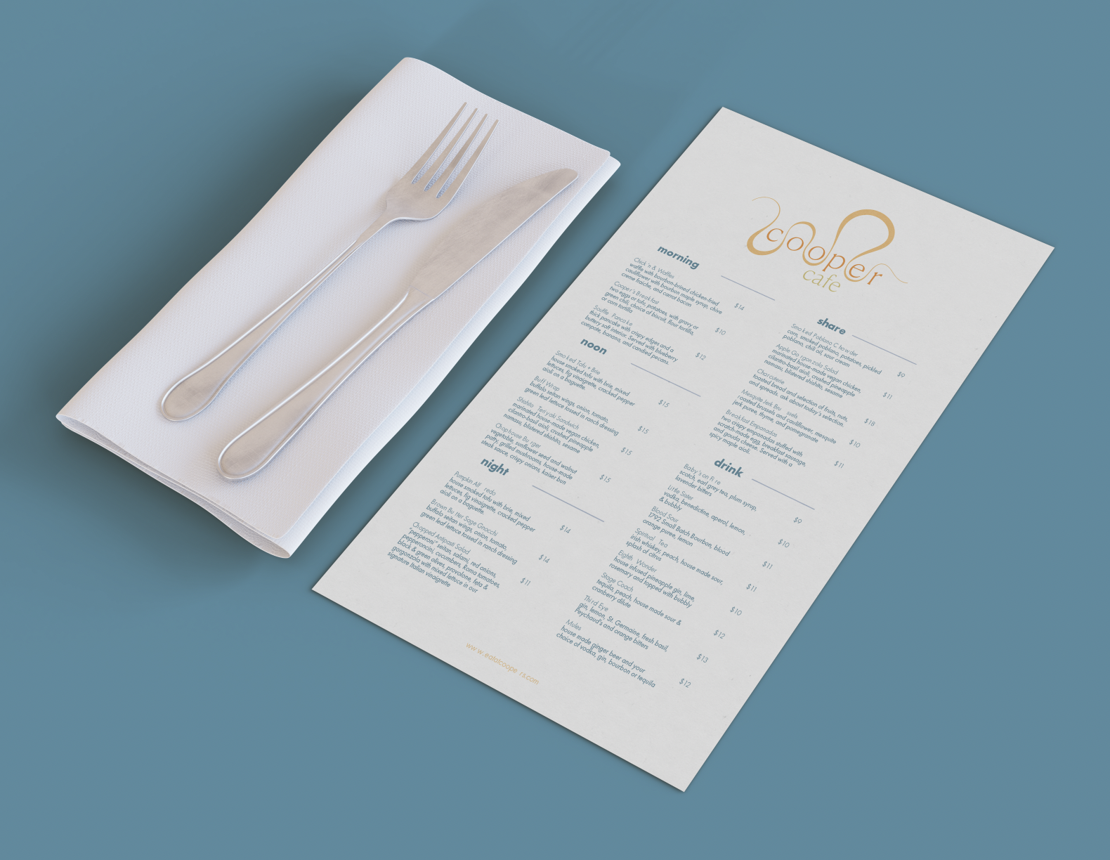
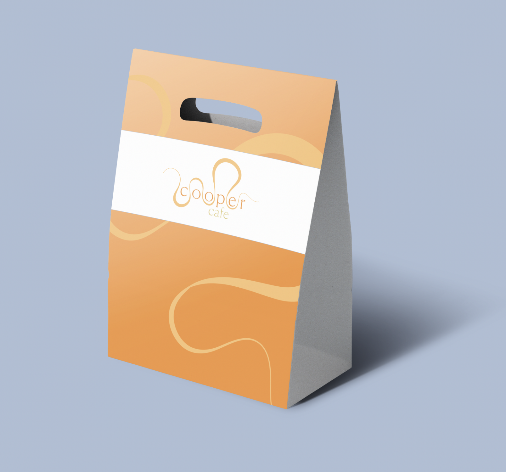
• Wavy Line Graphics: Inspired by the movement of Cooper’s signature sauces, the wavy lines symbolize cherished recipes and the cafe’s welcoming embrace of its community.
• Color Palette: A vibrant orange paired with calming blue captures the balance between warmth, nostalgia, and modernity.
• Clean Typography: Simple and approachable, the typography lets the food—and the cafe’s unique personality—take center stage.
This cohesive identity ensures a consistent experience across every touchpoint, from signage to menus, packaging, and digital platforms.

The Results
Cooper Cafe’s new look isn’t just about aesthetics—it’s a visual promise to its customers. The rebrand reassures loyal patrons that the recipes and atmosphere they love are still at the heart of the cafe, while also inviting new visitors to experience the blend of flavors, cultures, and community that define Cooper Cafe.
Whether you’re a lifelong regular or a curious newcomer, Cooper Cafe remains a place to gather, share, and savor.
Key Takeaways:
The rebrand preserves Cooper Cafe’s cherished history while inviting a new generation of patrons with a modern, approachable design.
Wavy line graphics inspired by Cooper’s sauces represent both beloved recipes and the cafe’s inclusive, community-focused atmosphere.
A cohesive visual identity across all touchpoints ensures the brand feels consistent and welcoming, from signage to menus and beyond.